 Block n Load
UI Design / Programming
 Block n Load
Block N Load is a free-to-play 5v5 FPS that I worked on during my time at Jagex. My task was to redesign and reimplement the frontend UI in a short period of time before the free-to-play relaunch of the game with the goal of giving the UI a more contemporary design and feel.
For this role I...
- Ported existing C# code from NGUI to Unity's native UI system.
- Refactored and added new code to support new features, such as the Shop. This involved a great deal of manipulating data from CouchDB and extensive use of LINQ to organise the data.
- Created UI mockups using Axure and Photoshop based on design requirements and a style guide provided by Creative.
- Implemented both the design and functionality of mockups within Unity.
- Worked with localisation to ensure the interface accomodated other languages.
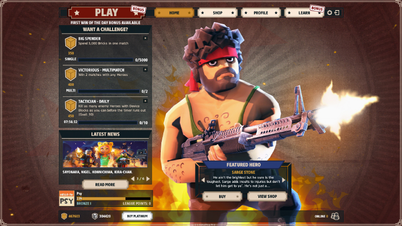
 home screen
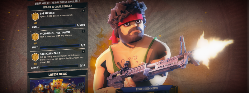
The challenges panel shows the daily challenges that are available to the player and how much progress they have made. They can optionally dismiss a challenge via the 'x' button which will free up a 'slot' that will be filled in when a new set of challenges are issued to the player.
The news panel is a rotator panel which automatically changes every few seconds if there is no user input. The movement and the large image that sits at the top of each news post helps to draw the user's eye. Clicking the 'Read More' button expands the news panel so that the user can read the full article.
The featured hero panel is linked to the character image shown in the background and as the panel is also a rotator, these images change and have a very large visual impact. It is the strongest drawer for the user's eyes which is important as it's purpose was is to advertise the currently featured shop item and to encourage the player to either buy or find out more about the particular item on view.
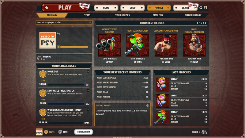
 profile summary
The profile summary is a condensed version of all the other sections of the profile. It includes the player's personalisable 'player card' in the top-left, their best heroes based on win rate, their most recent best moments based on match history, and a record of their last three matches.
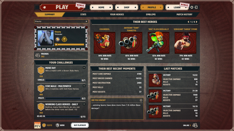
By using the search found in the top-left corner, the player can find another player's profile to view their summary and player card.
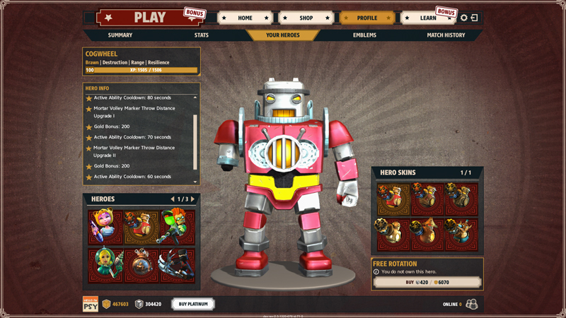
 profile heroes
'Your Heroes' is a section dedicated to information about the heroes that the player has in their account.
The character model in the centre is animated and can be freely rotated with the mouse, allowing the player to gain a look at each hero in greater detail than could be easily done in game. The model has a large scale to help emphasise the 'cool' factor of the hero which ties in with the idea of encouraging the player to either purchase heroes which they only have in their inventory through the weekly free rotation or skins they can view but do not own.
If a player selects a hero that is on free rotation, they are provided with a prompt in the bottom-right that encourages them to purchase the hero. The same idea is used for each of the hero skins which - again - uses the same prompt to encourage the player to spend currency.
 profile emblems
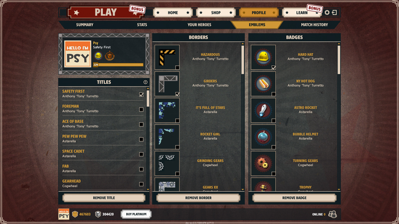
The Emblems section allows the player to customise their 'player card' shown in the top-left which is shown elsewhere in the game, such as the pre-match lobby when mousing over a player's name. This kind of feature is important as it allows players to express themselves and stand out from other players. It's the same reason why many games nowadays such as Team Fortress 2, League of Legends, and CSGO have a vast array of cosmetic items and tie them into an MTX system with great success.
It's worth noting that the 'Remove' buttons at the bottom of each panel provides a quick way of removing that particular element from the player card without having to scroll through a long list of items to manually untick the currently selected item. Shortcuts are always good when dealing with long lists such as these.
 match history (Photoshop mockup)
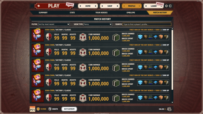
Match History displays the player's most recently played matches in a visually appealing away. By using large icons to seperate each sub-section, and a small heading combined with a large number, it helps to make the information stand out in a way that would otherwise be very dry.
As with the other sections, it is possible to view the match history of another player by using the search provided.


