 CTF Converge
personal
 CTF Converge
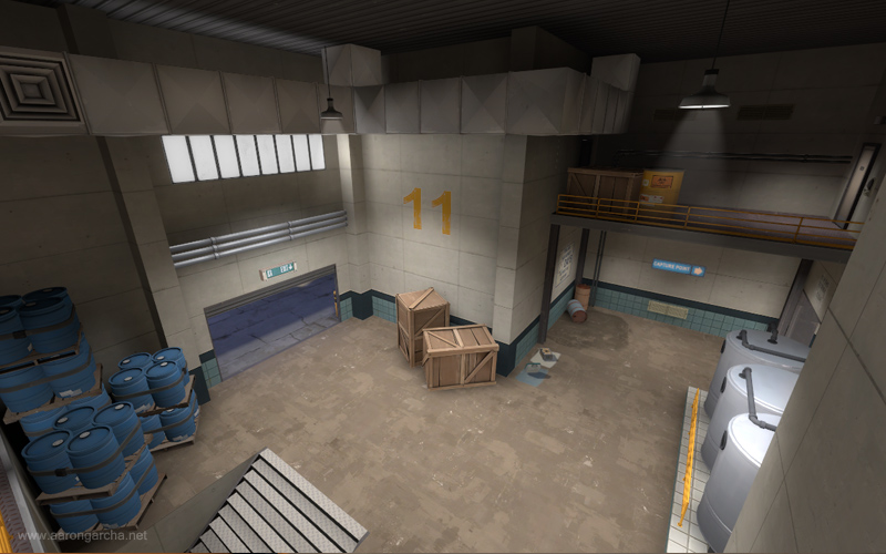
description
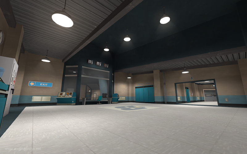
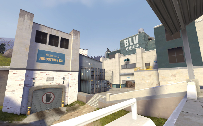
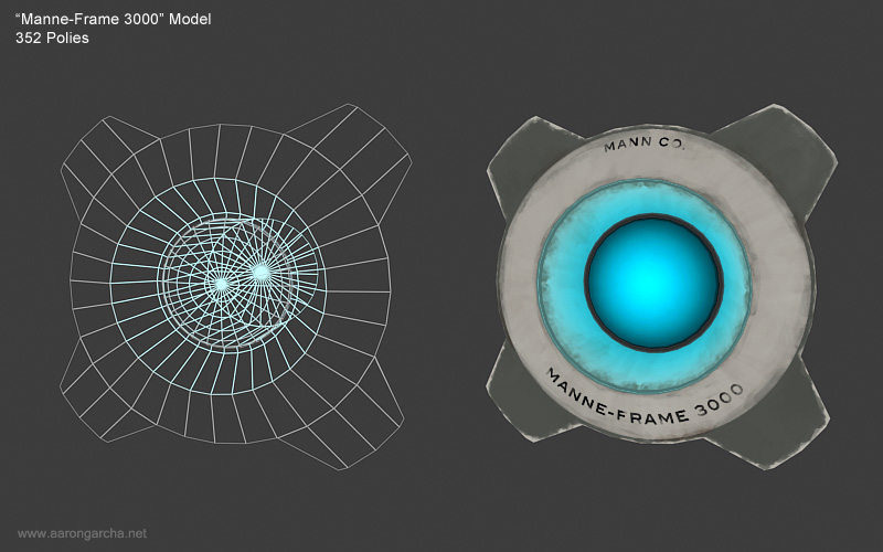
My entry into the TF2Maps 'Competitive CTF' contest, Converge is a CTF map where a single flag at the center of the map is fought over and must be delivered deep inside the enemy's base in order to damage and destroy a computer mainframe.
The map can be downloaded from the Steam Workshop here.
role
As this was part of a competition, I was tasked with creating a map within a 6 month period ranging from January to May 2010. This involved paper layouts, blockouts, testing and iterating, optimisation, implementing a new variation of CTF, and applying an art pass.
design commentary
Like many people, I never liked CTF in TF2. It was never any fun and always felt like an absolute chore to play.
It was the first TF2M contest of 2010 which inspired me to create Converge; a map with a style of CTF different from the standard, something that would inject a bit of life into the gamemode, and something that would prove that CTF in TF2 can be fun!
At the beginning of development, I thought about why CTF doesn't work very well in TF2.
When both teams must defend their flag whilst also having to take the enemy's flag and bring it back to their own base in order to score points for the team, an issue arised where players preferred to defend their flag instead of pushing forward to take the enemy flag as too much effort would be required to break even an average defence in order to reach it.
The main issues are as follows:
- In the majority of CTF maps, the flag is always deep inside the enemy base making it difficult to reach as the flag room can be easily locked down by sentries.
- When you reach the enemy flag it is very difficult to extract the flag and take it back to your own base without being killed.
- When the enemy drops your team's flag, your best option is too simply stand around and defend it until it returns to your base.
- Once your team's flag has been taken by the enemy and is dropped inside their base it is very rare that you'll be able to defend it until it returns to your base.
These issues lead to long and boring rounds where both teams remain relatively static; a stalemate situation.
using Invasion CTF
This is why I planned to create a map that implemented the same mechanics of CTF but with a simple twist which would lead to rounds that are far more dynamic.
The idea was something that has been done in countless games (including TFC, I believe) and is often known as 'Invade' which is as follows:
- There is only 1 'neutral' flag that always spawns and returns to the centre of the map. Either team can pick it up.
- This means that players/teams no longer have to hang around a dropped flag to defend it until it returns to base. Now, as soon as the flag is dropped, they can pick it up and attempt to plant it in the enemies base. This creates exciting back-and-forth gameplay which revolves around counter-attacking.
- You have to plant the flag in the enemies base. Not your own.
- This essentially cuts the usual CTF trip in half, removing the frustration of having to move out from your own base into the enemies base and then having to survive the trip back to your own base. It also actively encourages players to build forward-defences instead of hanging around their own base.
- When the enemy has the flag, it is always brought towards you.
- This removes the problem where your team's flag would be taken by the enemy and dropped somewhere in their base, making it practically impossible to reach and defend. With Invade, you can remove the flag carrier then grab the flag and perform a counter-attack.
In addition to these core mechanics of Invasion CTF, I included:
- A flag cooldown mechanism upon capture.
- When the flag was captured, it would return to the centre. Most of the time the team that has just planted the flag in the enemies base will have some players hanging around the centre waiting for the flag to return. In order to counter this and to prevent a team from completely dominating another team very quickly, I added a 10 second cooldown mechanism which would prevent the flag from being picked up until the timer expired.
- A 'mercy' system.
- The idea of the mercy system is to decrease respawn times for the team that has just been capped for a temporary period of time. This period would last for 30 seconds which would make it easier to flush out the enemies' still in their base and to allow them to reach the flag at the centre more quickly than the other team. Essentially, it gave the losing team a slight advantage that would give them a chance to pull the game back into their favour.
the layout
An initial prototype layout for Converge was roughed out in about 3 - 4 days and several versions were developed and playtested for about 12 weeks during the contest.
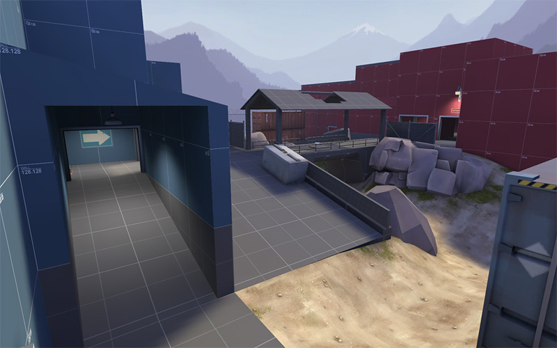
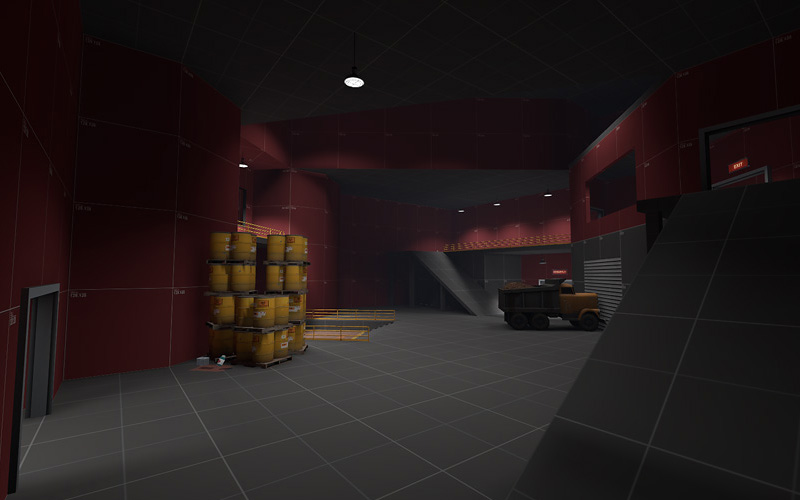
Early alpha versions of Converge. The angular design of the capture room remains to this day.
After that time, I pushed forward with an art pass which took about a week and on the final day included a 13-hour crunch to finish off various areas before the contest deadline.
Below is a description of the layout and the thought process behind each part.
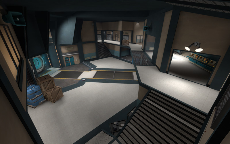
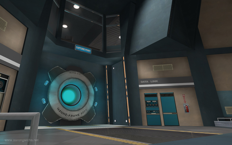
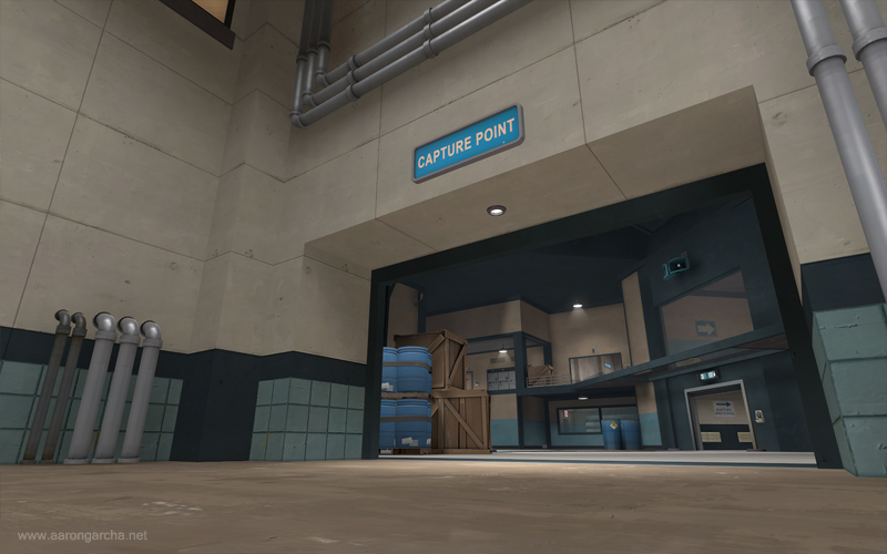
BLU's capture room. Complete with a 'Manne-Frame 3000'.
In the majority of CTF maps, the intelligence room tends to be small and easily locked down by a single engineer due to the lack of space and/or lack of routes in to the area.
My intention with the capture room of Converge was to go against this and make it difficult for a single engineer's sentry to cover the entire area, encouraging them to be a little proactive in their role instead of setting up their buildings and turtling for the entire round.
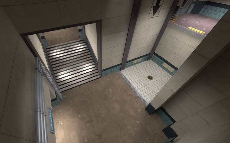
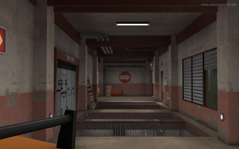
The far left flanking route for attacking players. Respawned players may appear from the ledge on the right who will instantly have a height advantage over any pesky enemies passing by.
The far left and right routes offer attackers the chance to take out sentry guns from afar (at the risk of spawning players raining on their parade) whilst the main upper and lower entrances that run straight down the centre of the room offer the shortest but least vulnerable path to the capture area.
These give attacking players plenty of choice balanced by pros and cons for each path as to ensure that not one particular path is used every time.
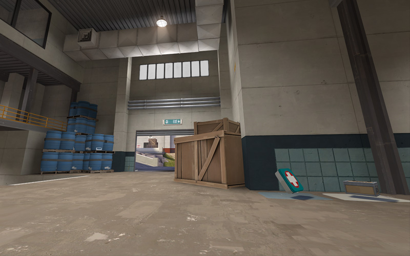
The right exit from BLU's base.
At the front of the bases, I situated ammunition and health near each exit just beyond a direct line-of-sight out into mid as to help support players trying to push out of their own base.
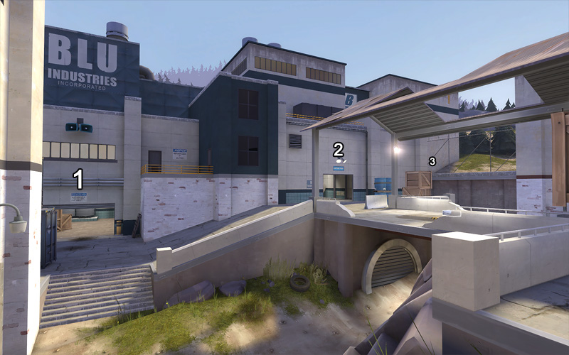
The centre area. '1' and '2' are the main entrances. '3' is the drop-down. That little grey blob on the right is the flag.
The central area of the map offers 3 entrances into each base; 2 main ones and a single one-way drop-down that serves as an exit from the base but can be used as an entrance by demomen, soldiers and scouts.
Initially, the entrances/exits were much further apart but after playtesting I decided to shorten the gap between the entrances/exits and reduced the width of the area so it became fairly narrow. I wanted to make sure that players weren't spread too far apart and I didn't want the flag carrier to be given too much space to move around as this would make it far too difficult to stop them on their path.

